Tyba's Design System
Rebuilding the design system of Tyba with a focus on technical optimization, improving the end user experience (product team) and taking advantage of the brand refresh.
challenge Description
Develop a new design system based on the current one, taking into account all implications with technology and with the least implementation effort. Definition of a new language, structures, patterns, communication towards the team and governance of the design system. Ensure the quality of the construction of each component, usability, adaptability and technical detail.
areas
UI Design - Design Systems
Date
2023 - 2024
client
Tyba was born with the objective of democratizing investments in Colombia, Peru and Chile. Encouraging its users to meet their goals through an integral investment platform that combines technology with advice. It is part of one of the most important financial holding companies with the longest track record in the Colombian region to meet investment goals.
roles and team
• 3 UI Designer • 2 UX Designers • 5 Frontend Developers
tasks
• Design audit • Technical validations with development team • Component design • Foundations and styles redefinition • New assets and illustration family • Stress tests on each component • POCs for efficient Figma migration • Documentation • Workshops and training for the team
ACHIEVEMENTS
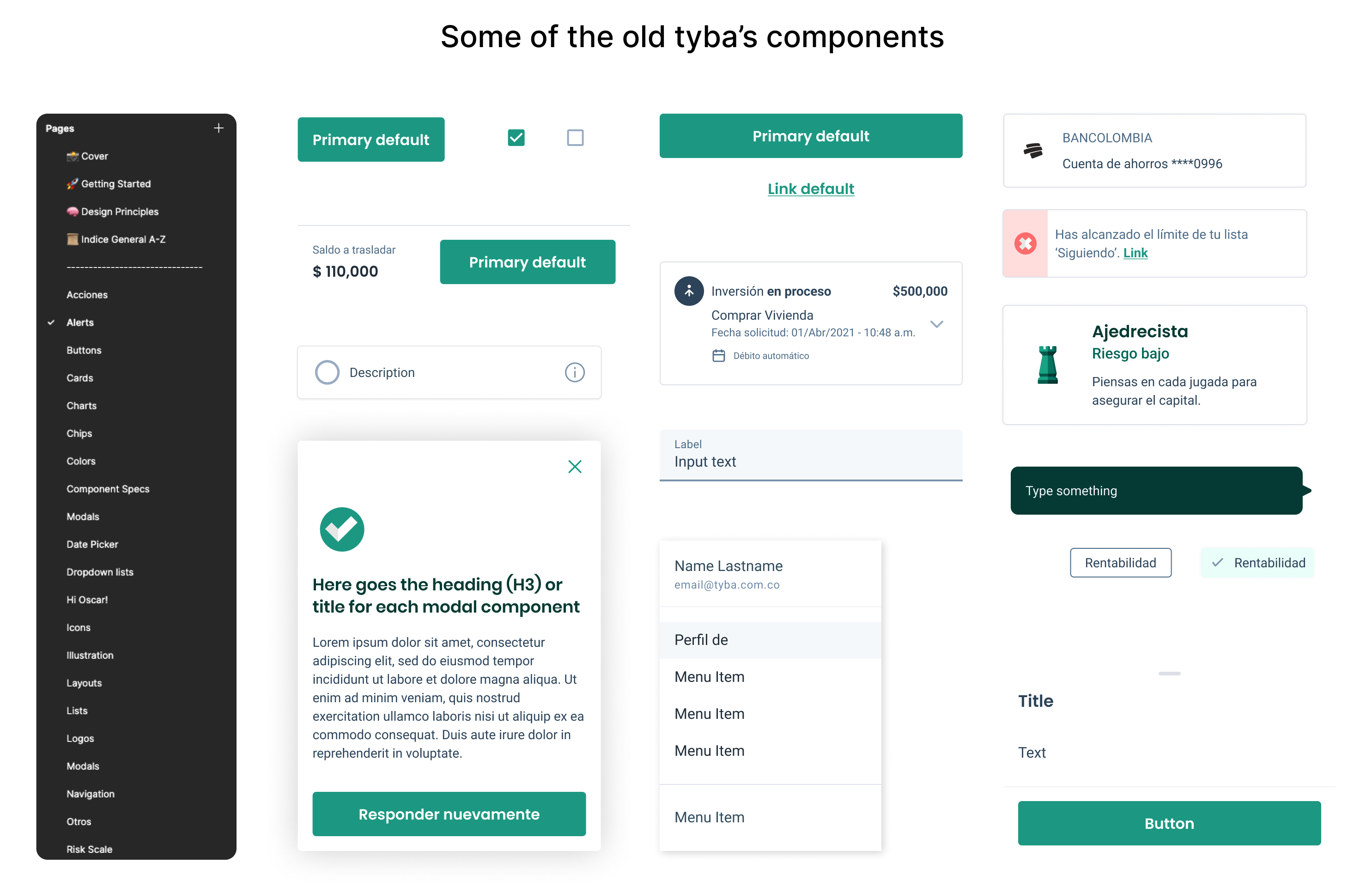
Auditing the old design system.
The problem had been identified: the number of components was too large (+300), there were no clear guidelines for their construction nor a defined language for their growth, so it grew uncontrollably and errors began to accumulate. There was no governance process over the design system and therefore, when a certain need was not met, the component was detached to generate more variations, increasing the level of inconsistency throughout the entire interface.
This, in addition, directly affected development, by generating rework and confusion about what existed. Therefore, an inventory and an audit of what existed was carried out to analyze the errors, pain points, involved people and define how to proceed, taking into account that the operation and new implementations could not be stopped to develop these major changes in an ideal way.
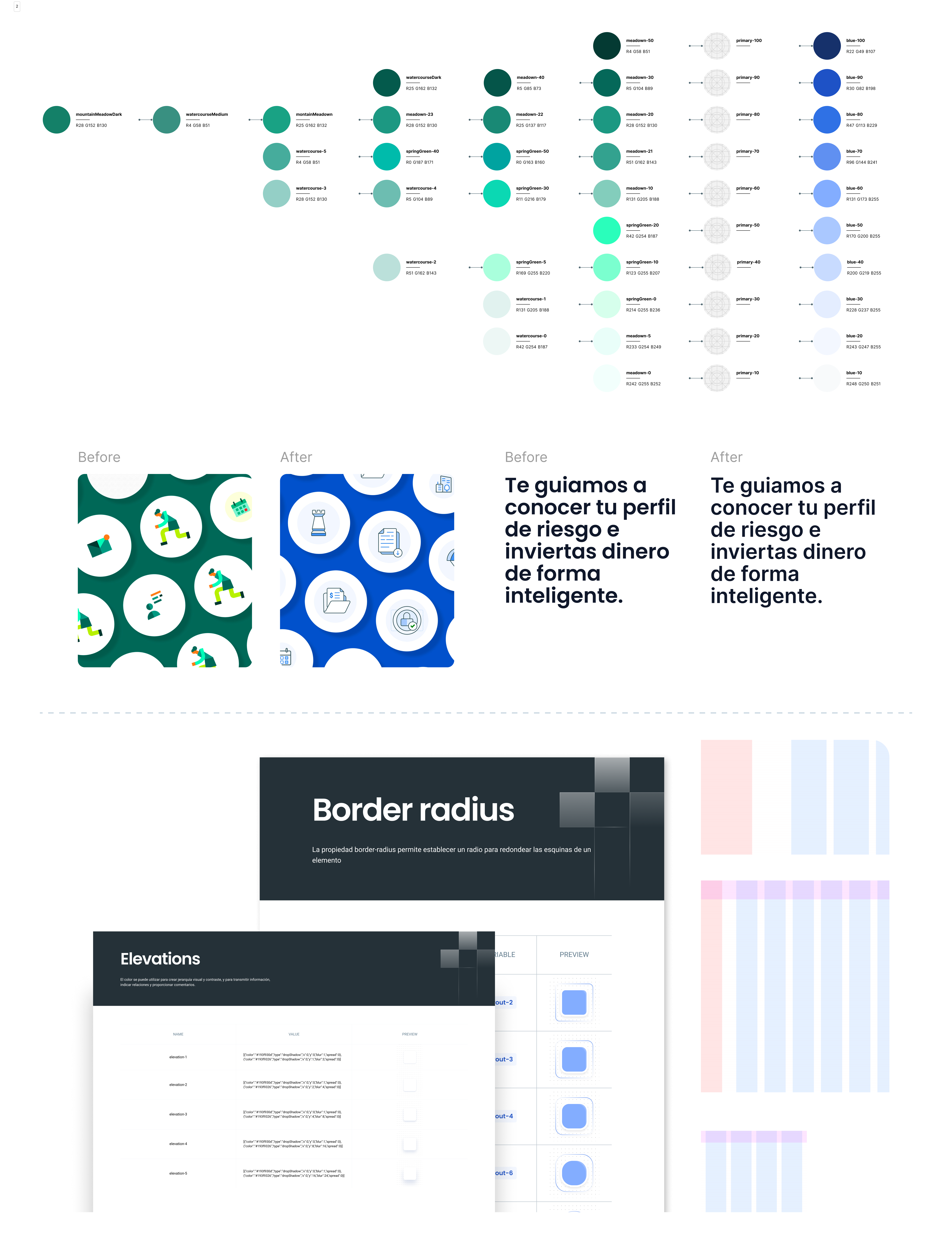
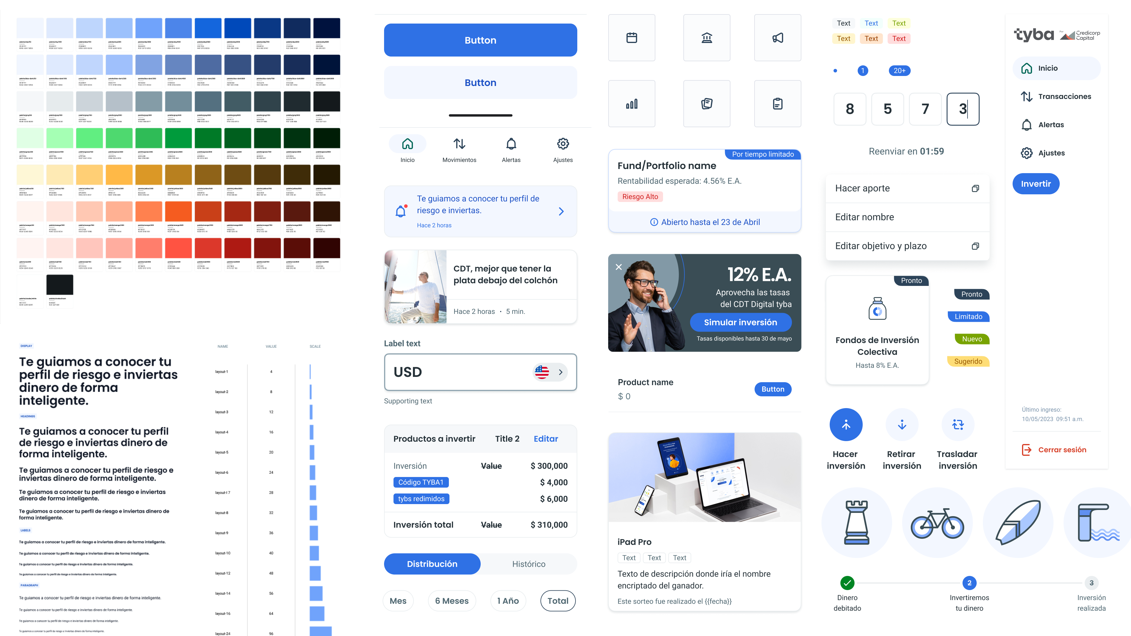
Considerations on the new brand and redefining Foundations.
A full rebranding was another consideration for this project. The company was changing its brand language and values due to a joint venture. This offered an opportunity to enhance tyba's appearance and apply these changes to all future work. The first step was to redefine and establish the foundations:
Color: We ensured color accessibility because the change was to be automated by code, not manual. We checked the brightness of each color style and matched it to its equivalent in the new palette. This was done with each existing color style (primary, secondary, and semantic).
Typography: We only replaced the font family to avoid affecting larger text and disrupting the interface layout.
Layout: We developed a variable system based on an 8 and 4 point grid for other parameters to utilize. This served as the single source of truth and facilitated easy changes in the future.
Other documented definitions included: Spacing, Padding, Border Radius, Border Width, Elevations and Grids.
Illustration and assets style were also intervened.
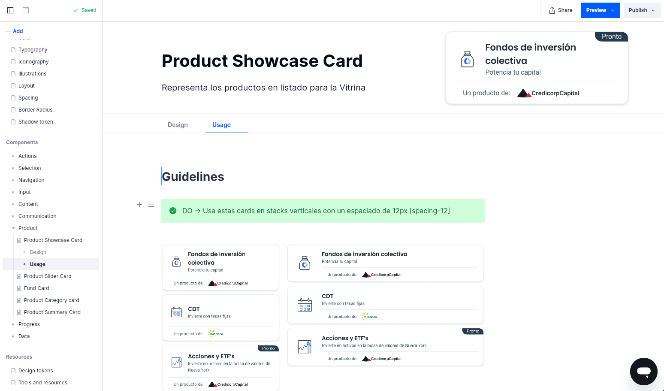
Six principles for Components.
Specialized Libraries: We've split our libraries (5) for optimized and relevant Figma analytics.
Categorization: Components are organized into function-related categories: Actions, Selection, Input, Navigation, etc.
¡No more super hero components!: Our components are flexible, usable, and easy to understand. They're designed to meet our metrics needs and promote specificity.
Consistent Properties: We standardize property names to avoid misinterpretation and make them memorable.
Efficient Building: We use tools to create adaptable components that can be applied effectively without breaking, saying goodbye to "detach".
Technical Specifications: We provide detailed anatomy of each component for accurate development and better understanding.
Documentation and guidelines.
To establish a language and usage guidelines from now on, it was necessary to document in detail everything proposed. This was achieved by using a specialized platform in which written and visual information was recorded for each component: Anatomy, Behavior, Interaction, Usage and Code.
Training sessions and application workshops.
Not all of the design team was able to get involved in the project's development. Although deliveries were made periodically, according to progress, there were many changes and decisions along the way. For this reason, in the final stages it was necessary to take the team (including UX Designers and others) to intensive training sessions, workshops and practices that allowed for understanding and greater adherence to the concept, language and guidelines set out for correct application.
WHAT'S NEXT
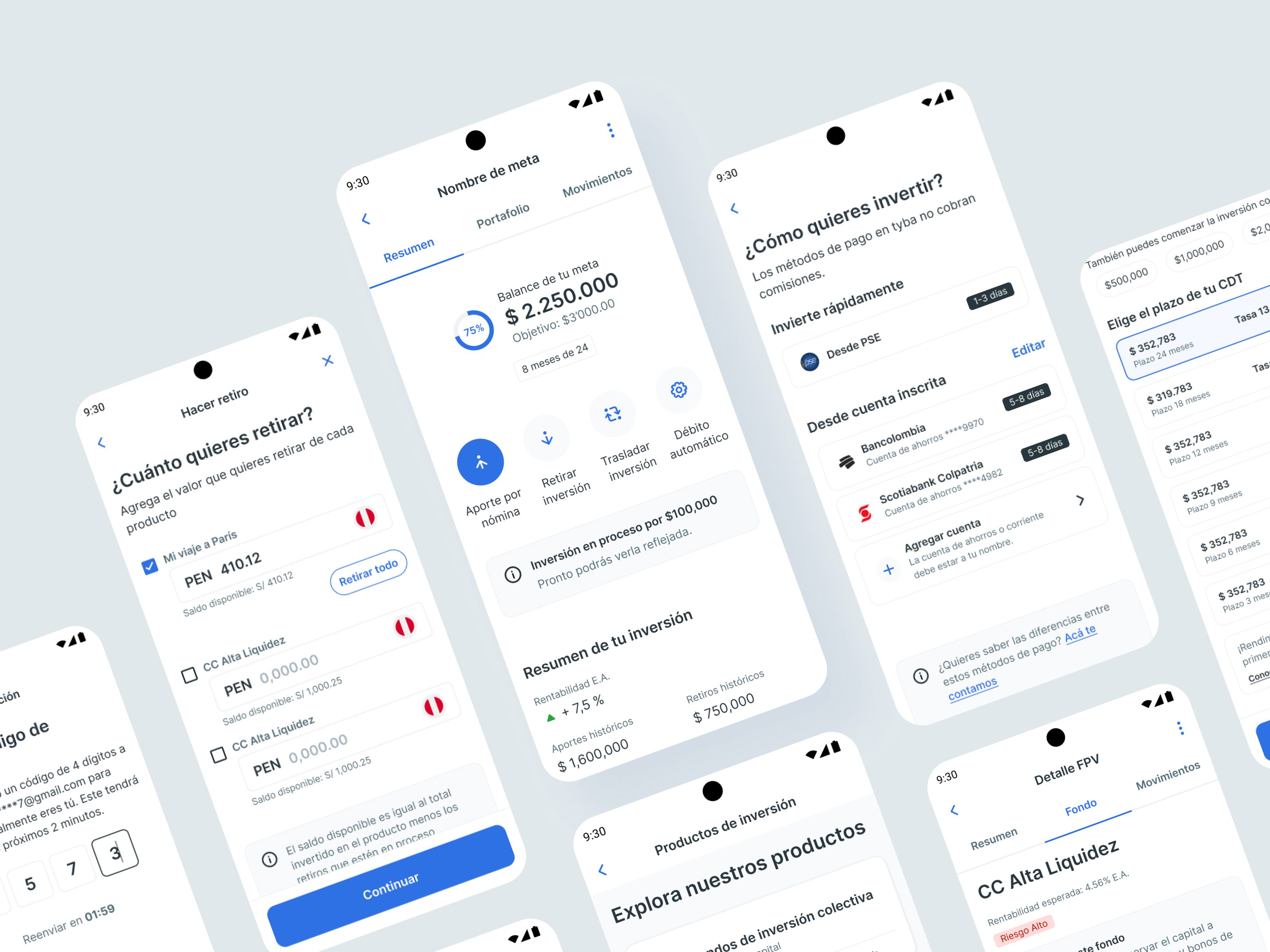
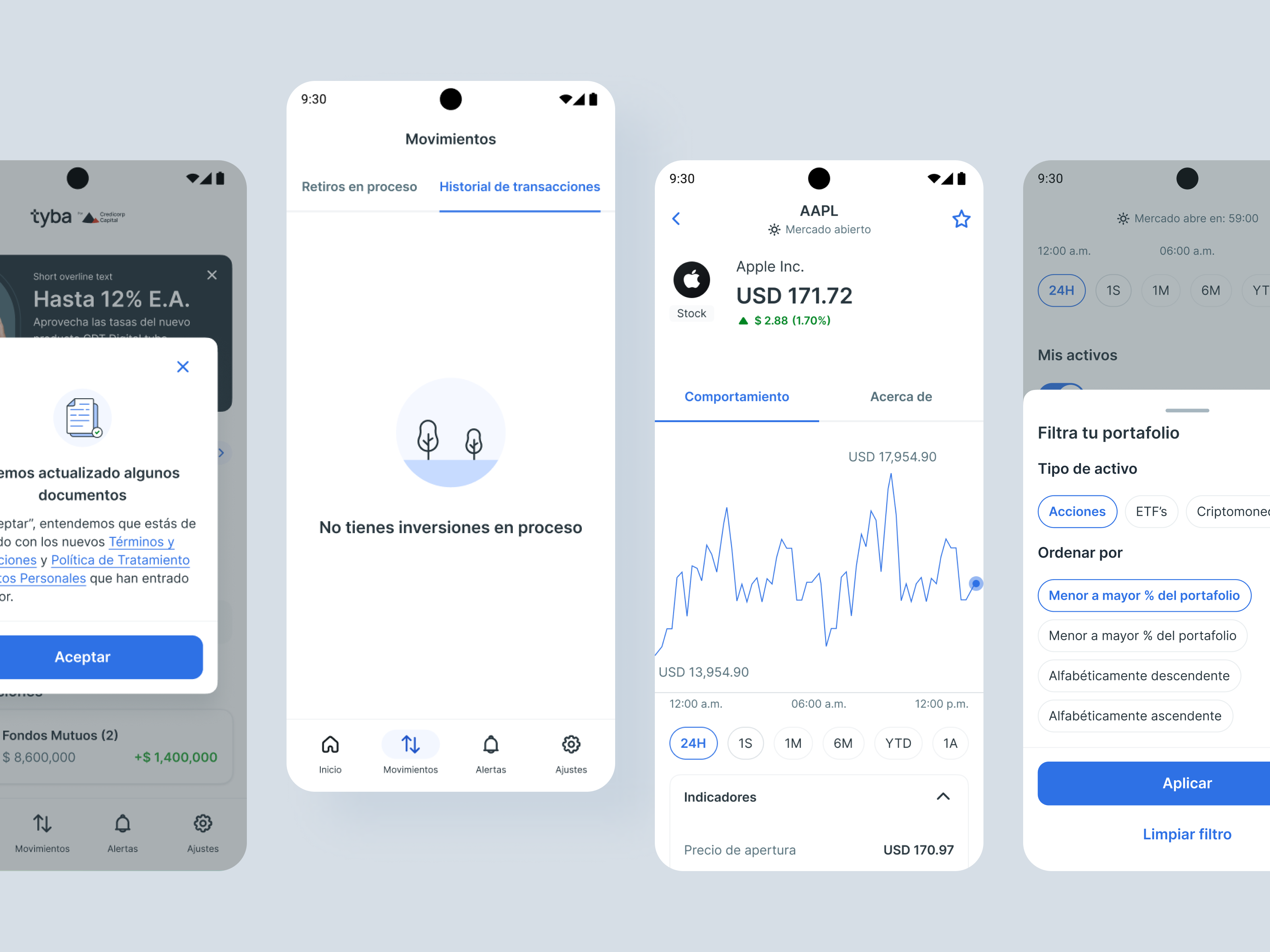
This project is currently in the implementation phase. From the design end, we are running QA reviews over each component delivered by the frontend team to guarantee functionality, look&feel and specification goals are being met correctly before starting to be used in the next phase: application over each flow and further development.
LIMITATIONS
It wasn't feasible to halt product operations and implementations for an immediate transition to the new design system. We needed to develop an incremental process that allowed the full application of the new system over time. This involved initially launching styles such as color, typography, and logos to meet legal requirements for the joint venture. We could then progress to replace assets and ultimately, each component.