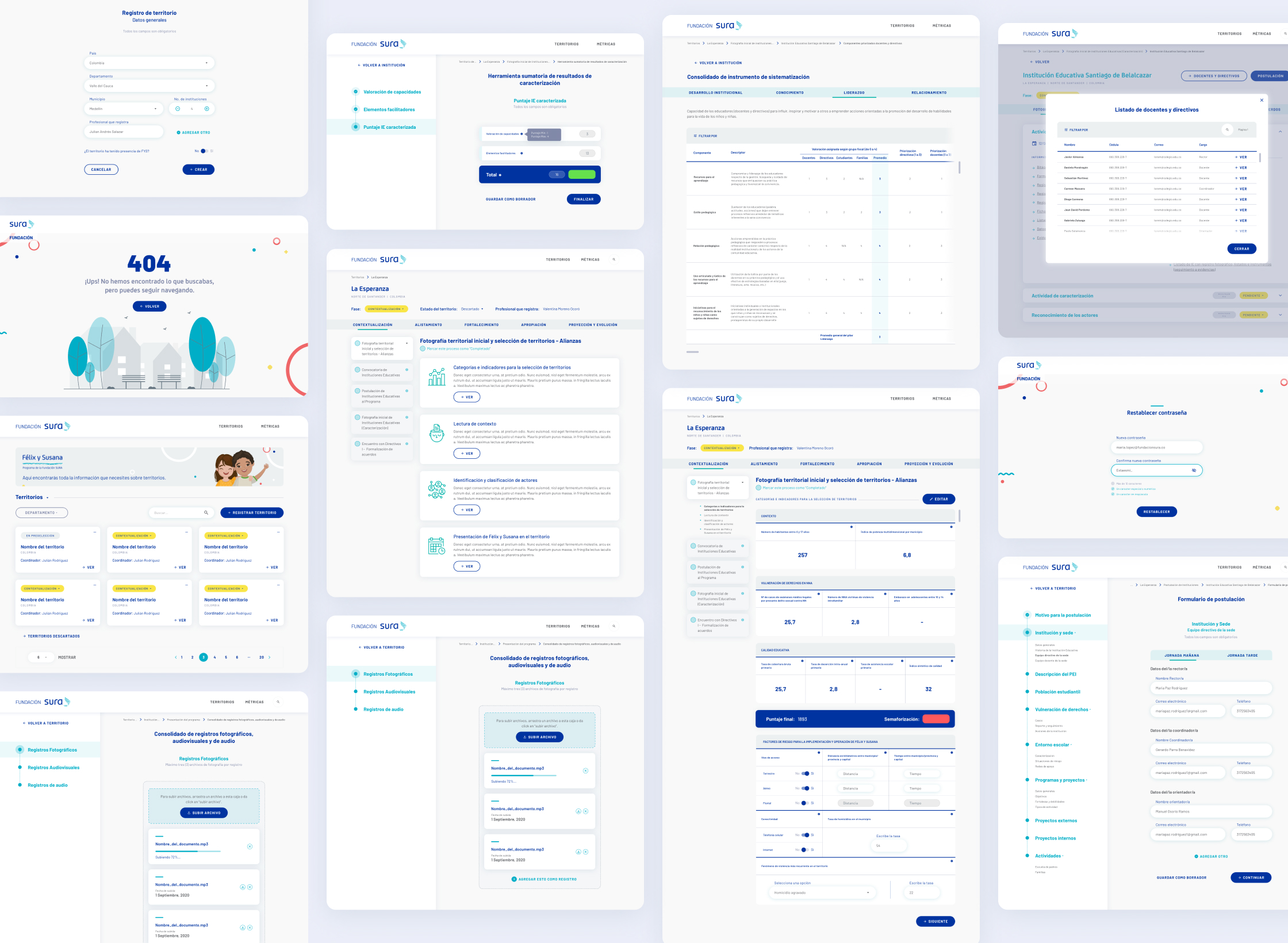
Félix y Susana
Making the management of Fundación SURA initiatives more effective, through the design of a digital platform for monitoring objectives, processing data and results.
challenge Description
Design of user experience and graphic interfaces of a digital management platform for the processing and hosting of information that allows the staff of the Félix and Susana* program to unify their management in a single point. *Félix y Susana is an education program of the SURA Foundation, which helps boys and girls build meaningful learning and experiences, and decide on the care of their bodies, their lives, and their relationships, through the strengthening of protective educational environments and inclusive. Currently, it is implemented in public educational institutions in Colombia, the Dominican Republic, and El Salvador.*
areas
UI Design
Date
2021
client
Fundación SURA is one of the subsidiaries of Grupo Empresarial SURA, it focuses on creating well-being and sustainable development through the strengthening of capacities that improve educational, civic, and cultural conditions as axes of social transformation in Latin America.
roles and team
• 1 Project Manager • 1 Research & Strategy Consultant • 2 UX Designers • 1 UI Designer (me) • 2 Front-end developers • 2 Back-end developers
tasks
• Structuring of User flows • Generation of a design system • User interface design • Consulting and documentation • Review of libraries for dashboards and different features • Prototyping and support in testing • Ideation and co-creation sessions with stakeholders
ACHIEVEMENTS
Simplify processes.
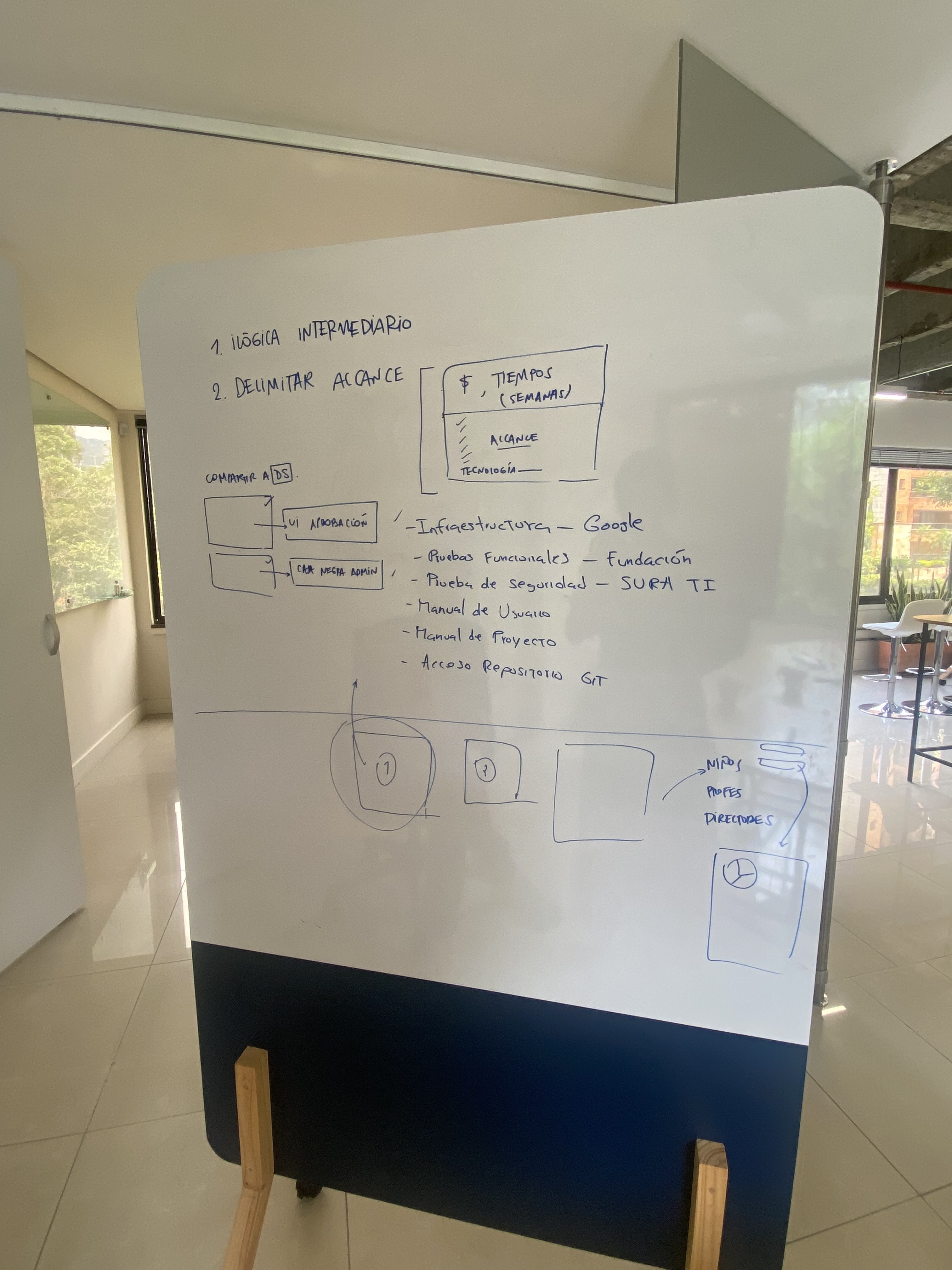
Identify the task route executed by the staff in charge of the Felix and Susana program; as well as the material and data collected, the duration and moments of each process, allowed a deep analysis of the flows that would need to be reinterpreted in a digital environment.
This meant detecting pain points and key needs at each moment of the program, which were later translated into features for a custom-designed management platform.
The next thing was to limit, reduce or discard certain points of the flows, understanding that the platform would be a data processing and hosting tool, but it should not cover each and every one of the program's processes. The important point was to preserve only the functionalities that allowed obtaining the insights, conclusions and results of the program regarding key objectives for future accountability to the foundation.
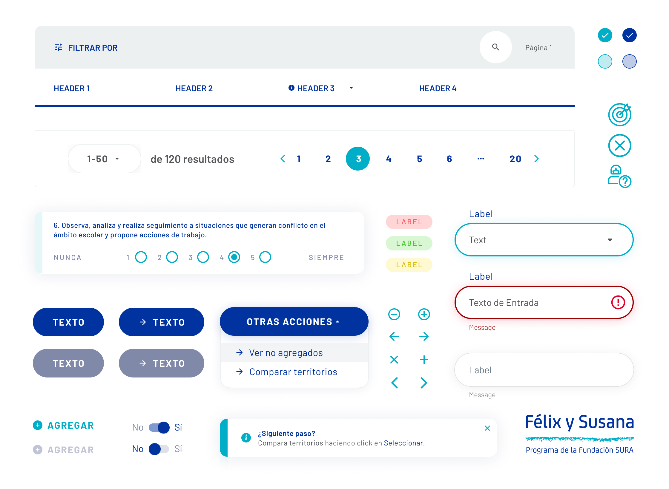
The user interface design was also aligned with the main goal of simplification. For this reason, the patterns and components designed were based on the fundamental heuristics of user experience, to guarantee user recognition and fluidity throughout the use of the platform.

Approach to data visualization.
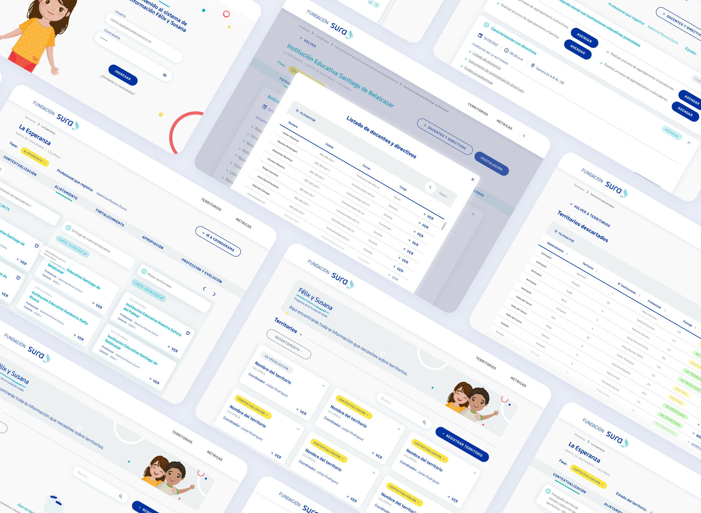
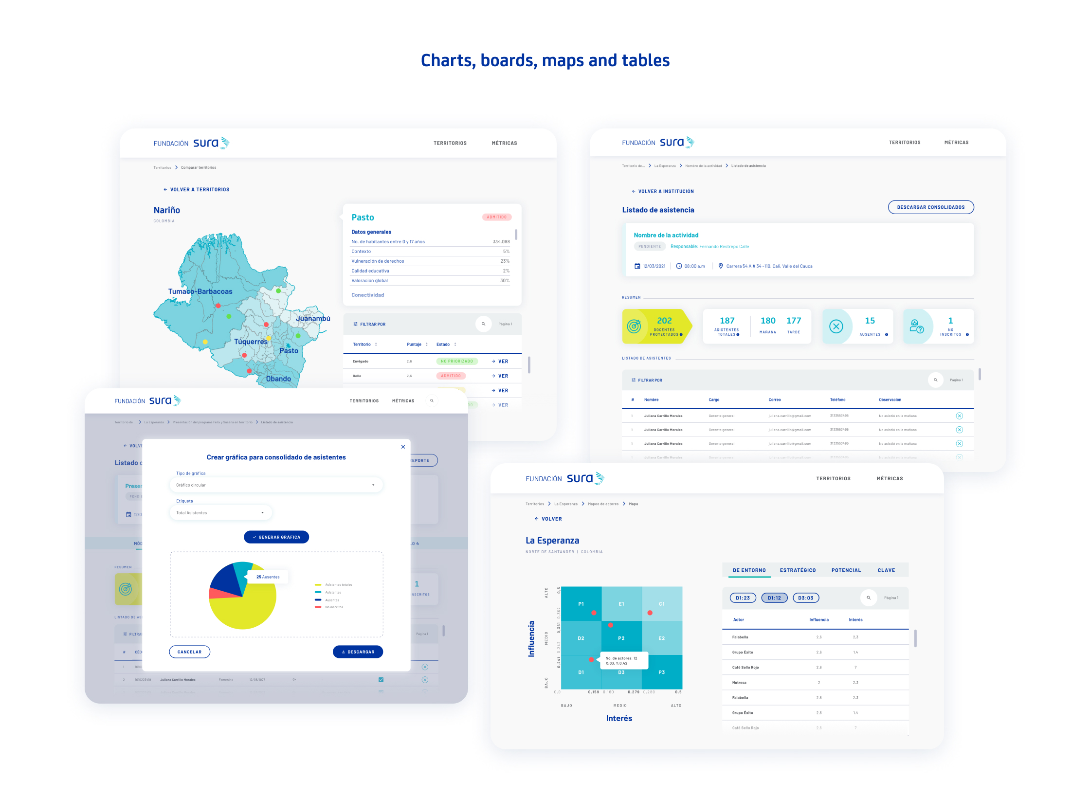
One of the strengths was in the data. Understanding these as the main resource for program coordinators. Previously, data management was mostly manual for them, using basic documentation tools such as excel and word. However, the information was presented en masse and organized in the form of long pages and tables, making analysis difficult and time consuming.
With the creation of Félix and Susana's platform, we achieved an important approach to the visualization of key data (information collected in co-creation sessions, to limit the scope). With this, maps and graphs of different types were implemented, which in turn could be manipulated, allowing the crossing of information for the generation of reports and the possibility of exporting. On the other hand, the tables did not cease to exist, but we managed to purge the information required to present cleaner tables and effective filters.
A systematic approach to scalability.
Félix y Susana is a program that takes four years to run completely in each territory, with its different phases. By studying the structure and methodology of the program, we were able to find a latent need, which is to make the product always adjust to the changes that may occur during the long duration of the program or the new definitions that may come from the side corporate. A consistent design system with a focus on scalability allows us to achieve this.
It was key to think about the design of the platform with simple but very flexible elements, limiting the number of components as much as possible to avoid visual overload and facilitate recognition and usability. And above all, the design at the level of larger patterns was intended to be extended without having to be restructured from scratch. In other words, the program can add more stages, phases, requirements, and change the order of certain processes; all this, without affecting the current design at higher levels.
LIMITATIONS
Communication between program stakeholders regarding the client (internally) was intermittent and occurred in widely spaced terms of time. So at a certain point, the focus was extended to more and more complex functionalities, which were not within the initial scope of the project. This resulted in the need to stop the project to rethink, with consultants from Research and Strategy, the new definitions that would allow the objectives to be defined again and the scope to be shortened. With this, the direction the project took changed drastically, making the path clearer, unblocking the workflow, and allowing work to be resumed from what had been done. This also translated into changes to key flows and therefore to the design, as team member moves were also made.
WHAT'S NEXT
The project is still in the development stage. However, partial releases have been made to start the migration of data to the platform. Said releases have been made with the logic of first releasing the initial flows of the program cycle and thus, allowing the real progress in these first stages by the coordinators (end users) without interruptions.