Nequi
Improving the promotion and retention of Nequi’s services through a systemic approach to user interface design.
challenge Description
Diagnose, identify improvement opportunities and provide user experience consulting for Nequi's current website.
areas
UI Design
Date
2021
client
Nequi is one of Colombia’s first NeoBanks. With 10 million users to date, Nequi works to fulfill its purpose of improving people's relationships with their money, empowering them to achieve their goals with it, and be a part of their daily lives.
roles and team
• 2 User Interface Designers • 1 SEO Specialist • 1 Metrics Analyst • 1 Research & Strategy Consultant • 1 User Experience Designer • 1 Content designer • 1 Front End-dev • 1 Back-end dev
tasks
• Competitive analysis • Visual audit of the current site • Define visual guidelines for their brand in a digital context • User Interface design • Prototyping
ACHIEVEMENTS
Let’s speak the same language: a systemic approach to design.
From the beginning of this project, we knew that Nequi’s team needed to maintain and scale this website as soon as our development team finished it. That’s why we systematically approached the Website's design.
We believe that following a systematic design model is a way to put the team on the same page about what each part of your product or project means. The simpler the language, the easier it will be to communicate. This would allow anyone to know how to work within the Nequi website, even if they were new to the team or a third-party design team outside of Nequi.
That would be evidenced in less time in onboarding and understanding the libraries and templates made, in the long run, this meant less money spent on low-impact tasks. We were careful to not turn this into a straitjacket for future designers. Flexibility was our premise.
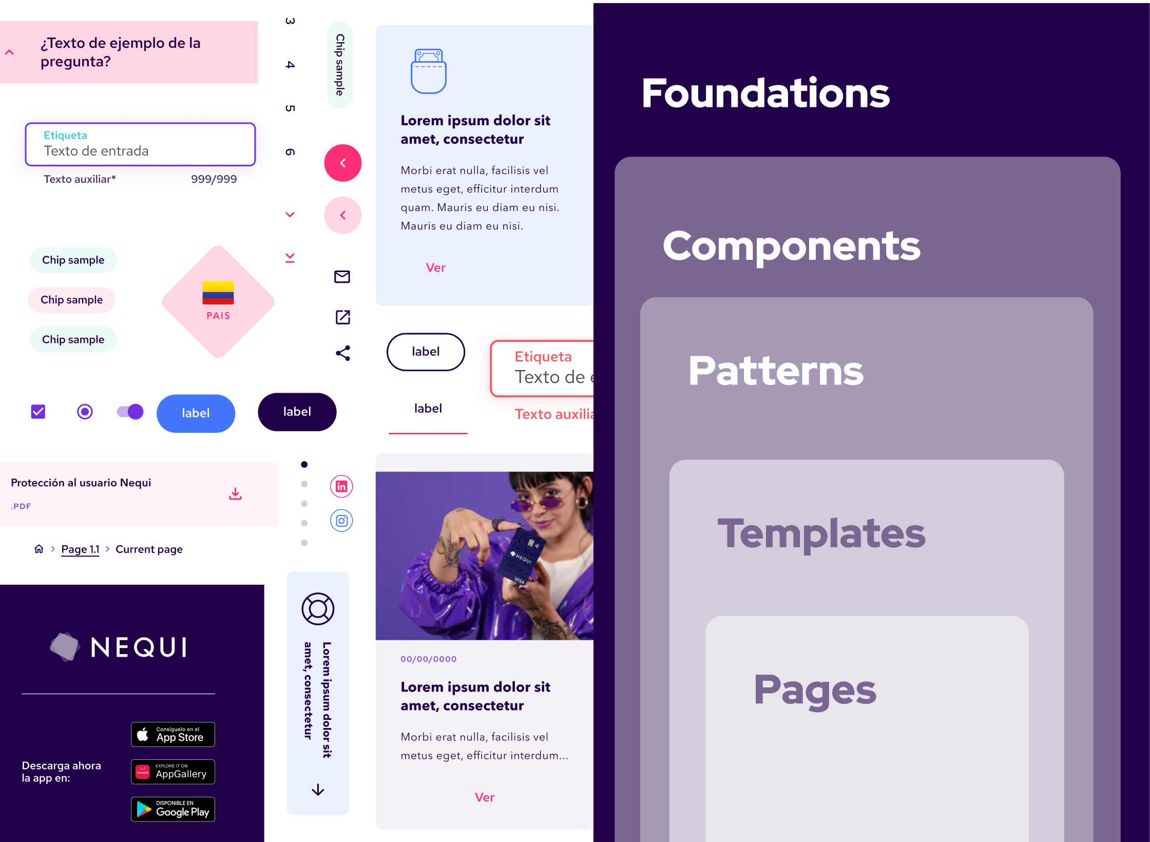
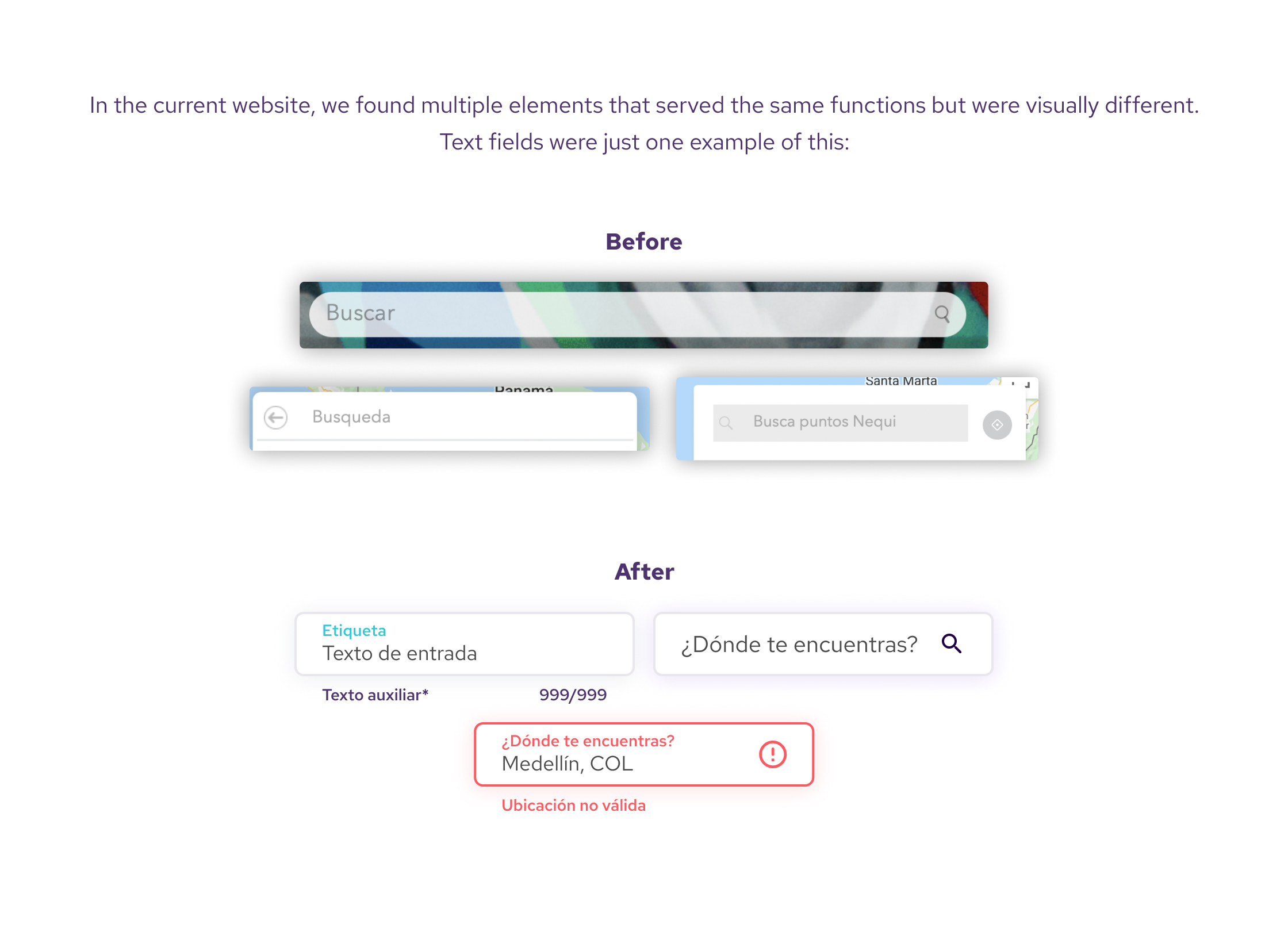
Let’s avoid reinventing the wheel.
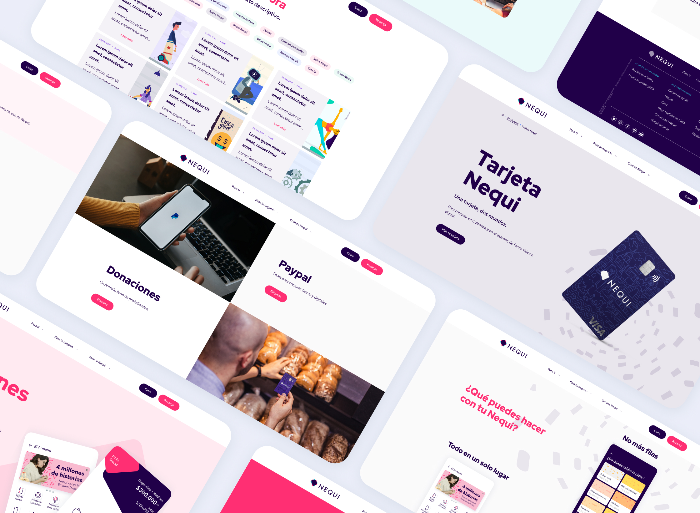
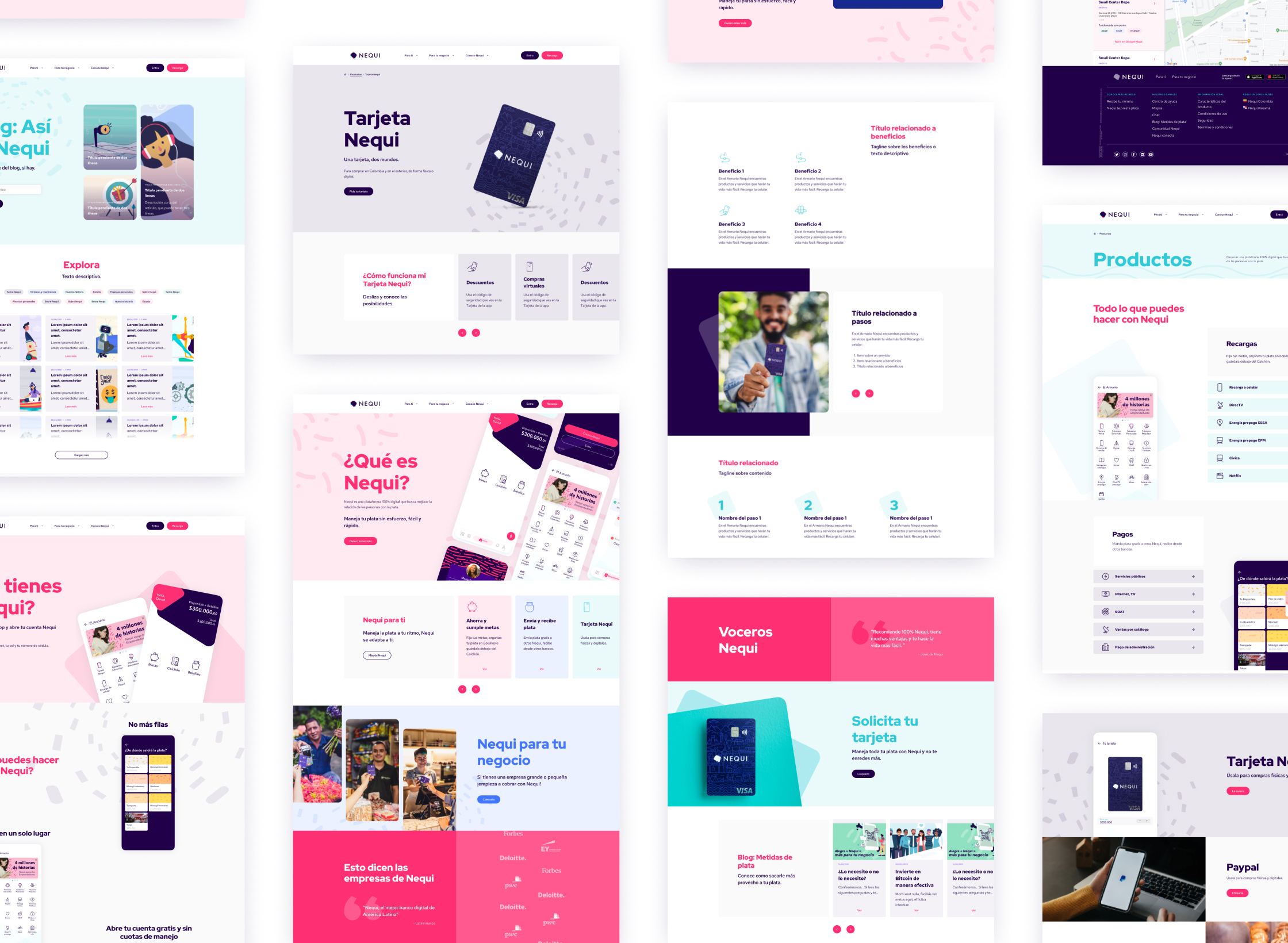
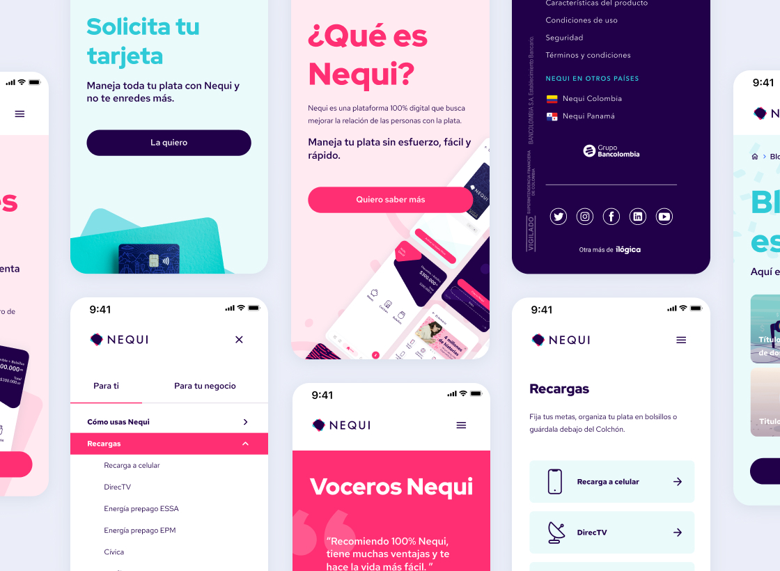
While auditing the current websites Nequi’s team worked on, we found multiple components that served the same functions but were visually different. A few examples of this were 5 different navigation menus and 4 different footers. These confused and frustrated users through the navigation.
We focused on delivering consistency in the many elements that shaped the site leading the user to a quick identification and recognition. We set guidelines and build as needed, but this meant that future designers would be able to build on top of what we’ve defined.
Let’s convey familiarity through all touchpoints. Not some.
On Nequi’s current site many pages looked different from one another although they were encompassed in the same brand. The drastically different and constantly changing visual language through all the architecture made the user feel lost and in an unfamiliar place to them like they’ve gone to another site from one second to the other.
To minimize this we implemented recognizable and replicable global patterns and styles. This commonality, consistency, and familiarity in digital interfaces are important, not boring.
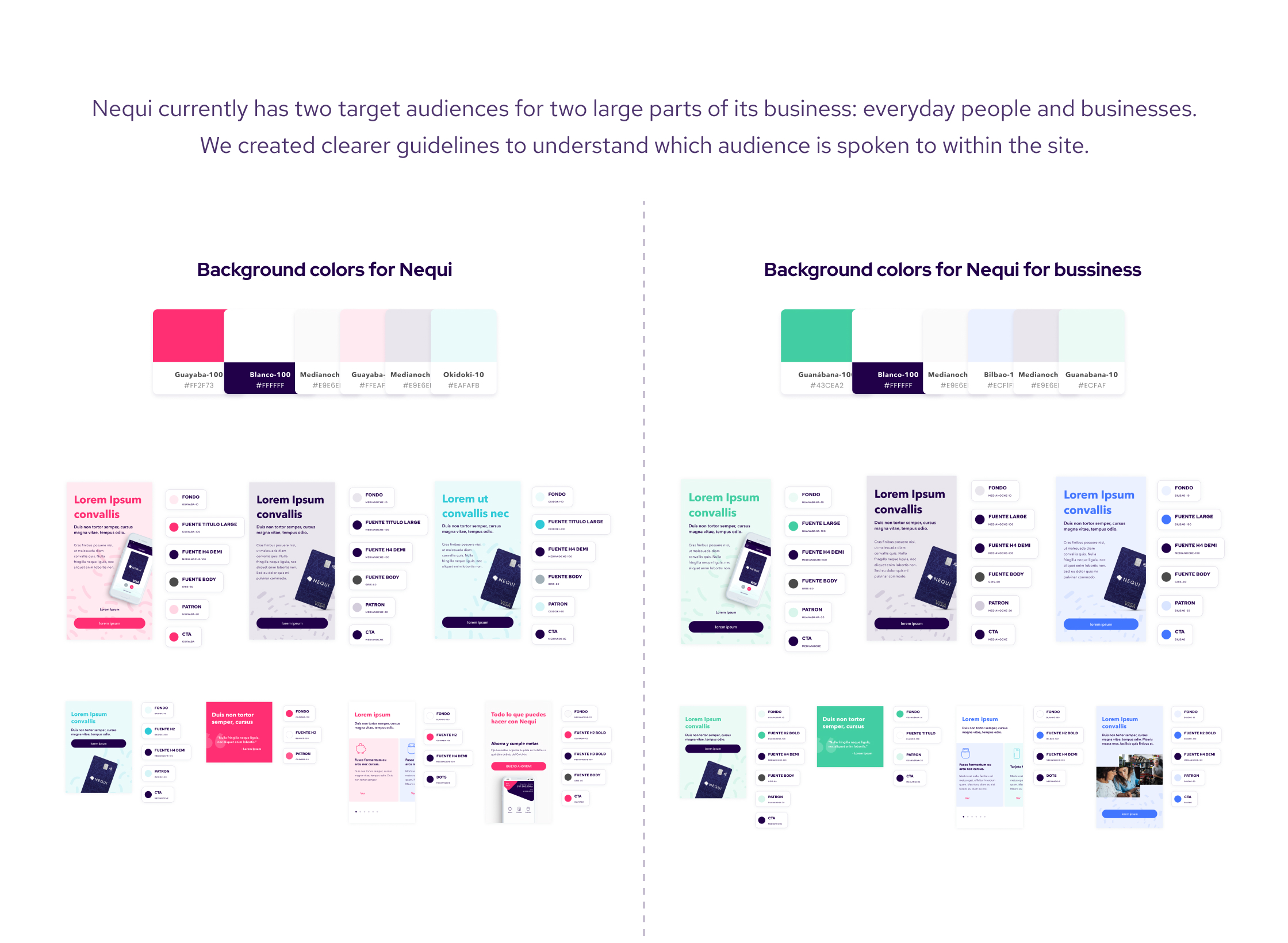
Promotion differs from service
Most of Nequi’s services are delivered to users through Nequi’s App. This site was mainly informative with very minimal transactional functions built in it. They both served different purposes. The app provided the service and the website's objective was promotion and retention. And in being different, in visual and functional aspects they must also be differentiated. With enough similarities to each other to be unified under the same brand.
More scalability
Nequi’s team had a big pain coming into this project: The current site was not built on top of a Content Management System that would allow them to quickly communicate to users new services, news, or support. To add or change something they’ll have to ask their development teams (that were already at full capacity with other tasks) to do it directly in code.
That's why we created flexible blocks, templates, and patterns to create any type of new content and a completely new structured menu. All these were designed to support business growth.
Nequi has a broad portfolio that will keep on growing for the foreseeable future. For this reason, we created a special place for them: the Nequi Products page. A modular template that could house not only every single product and service Nequi has to date but future ones, too.
LIMITATIONS
Nequi's primary color may be rose but this project wasn't approached with rose-colored glasses.
There were some changes from the way the design looked on the beginning of the project versus how it looks now on the mockups, that’s a direct result of working alongside Nequi’s design team and taking their feedback on a range of the proposal’s aspects.
While working on this project Nequi was going through major growth and inner changes at the company level that directly impacted their objectives and goals for the next couple of years. That, and the recent independence from Bancolombia (the bank that owned Nequi) made the project go to a halt just as we were about to enter the development phase.
WHAT'S NEXT
A re-design is most likely to happen with the same team that worked on this proposal and based on the work we’ve already done. So, not everything is lost and the team will be able to re-focus the work done on a new path leading to new goals.